


Top 10 Web Design and Web Development Best Practices for 2024


Table of Contents


5 Top Web Design Best Practices for 2023
3. Consistent and Intuitive Navigation
5 Top Web Development Best Practices for 2023
2. Optimized Website Performance
4. Progressive Web Apps (PWAs)
5. Accessibility and Inclusivity
We all know that a great website can make a massive difference for any business or personal brand. It’s like your digital front door, welcoming guests in and giving them a feel for who you are and what you do.
Just like any tech-related field, the rules of the game keep changing in web design and development. It’s a fast-paced world, and you’ve got to keep up with the new trends, tools, and tactics that pop up every year. And 2023? It’s a whole new ballgame!
In this blog, we’re going to chat about the coolest web design and development best practices for 2023. We’re talking about the biggies: mobile-first design, using white space like a pro, SEO-friendly development, keeping your website safe, and so much more.
Whether you’re building a website from scratch or spicing up an old one, knowing these best practices is pretty important. It can be the difference between a website that’s just “meh” and one that grabs attention, gets clicks, and even makes sales.
So, stick around as we dive into these hot topics. We promise to give you the good stuff – no fluff – to help your website shine in 2023.
5 Top Web Design Best Practices for 2023

1. Mobile-First Design
In simple terms, a mobile-first design means creating a website with the mobile experience at the forefront, then adjusting and scaling up that design to cater to larger screens, like tablets or desktops.
Why Is This Approach Crucial?
Well, it’s 2023, folks! And over half of all internet users are browsing the web on their phones. (Yep, you heard it right!) Plus, Google, our search engine overlord, favors mobile-friendly sites for its indexing and ranking.
So, if you want to get your website noticed, you better make it mobile-first!
Examples of Mobile-First Design
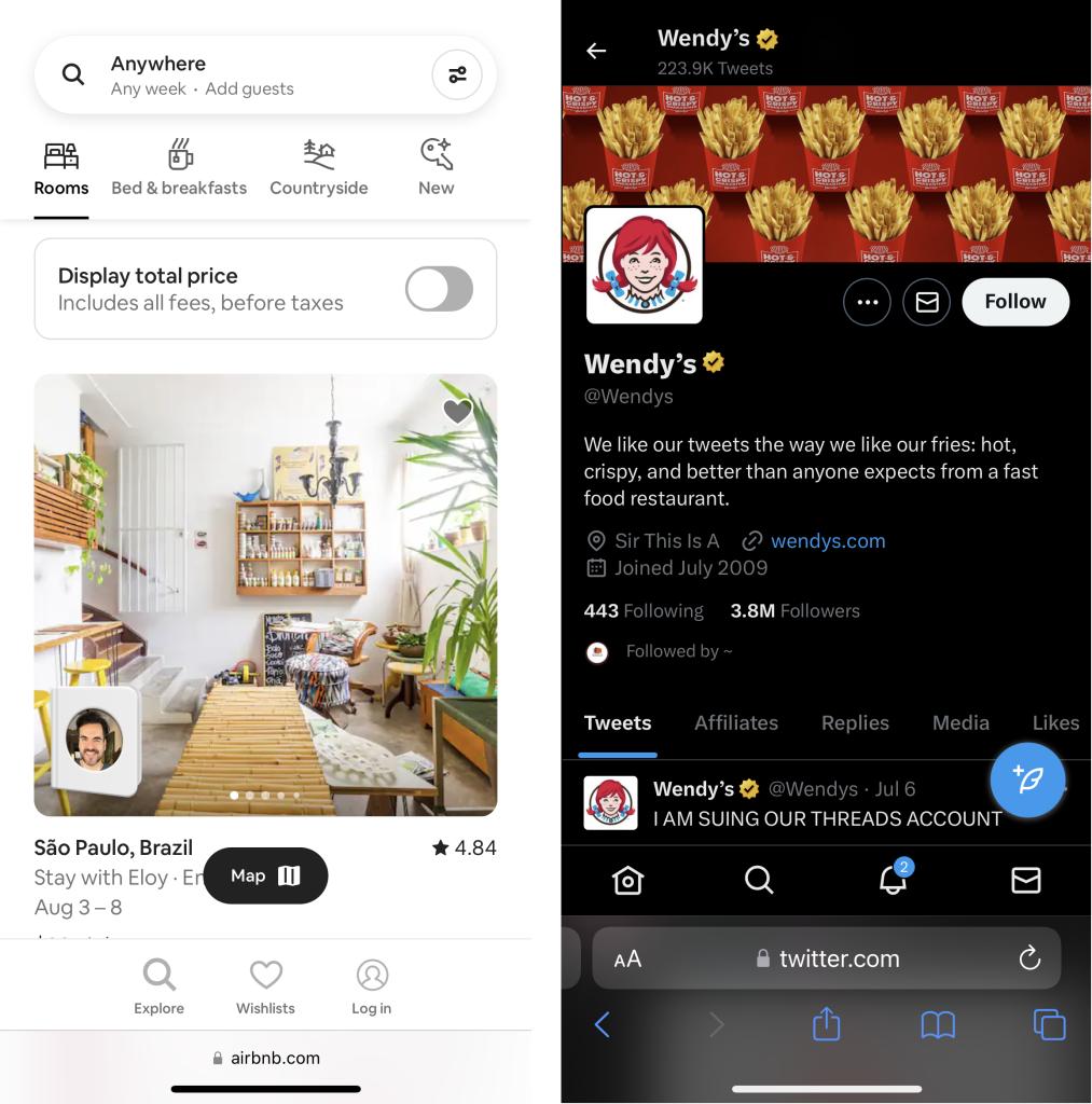
If you’re still puzzled about what mobile-first design looks like, take a peek at Twitter or Airbnb’s mobile sites. They’re sleek, user-friendly, and most importantly, they have all the functionality of their desktop versions but in a more compact format.
It’s like having a Swiss army knife in your pocket: You’ve got everything you need right at your fingertips!
Benefits of Mobile-First Design
• Increased Reach: A mobile-first design lets you tap into the vast audience of mobile internet users. It’s like throwing a wider fishing net into the sea—you catch more fish!
• Improved User Experience: When a website is easy to navigate on a mobile, users are more likely to stick around and engage with your content.
• Boost in SEO Rankings: As mentioned earlier, Google loves mobile-first designs. So, if you want your site to appear higher in search results, making it mobile-first is a no-brainer.
• Competitive Edge: In the cutthroat digital world, a mobile-first design gives you the upper hand. It’s like being the only runner wearing spikes on a muddy track—you’re bound to stay ahead of the pack!
2. Use of White Space
White space, also known as ‘negative space’, despite its name, doesn’t have to be white – it’s simply the space left untouched in your design. It includes the empty spots between text, images, and other elements on your web page. Like the silent moments in a thrilling movie, it’s what gives your content room to breathe.
Benefits of White Space
Now, why is this white space such a big deal in web design? Here’s why:
• Boosts Readability: It’s all about making it easy for the eyes. Just like how you’d enjoy a book with clear and well-spaced sentences, white space in your design increases the legibility of your content, letting your users take in and understand your message effortlessly.
• Creates Balance: Nobody likes a crowded room, and it’s the same with web design. Proper use of white space ensures your web page doesn’t look like a busy flea market, but rather, a sleek, modern showroom.
• Highlights CTAs: Want to draw attention to your call-to-action buttons? Put them in a comfy white space. It works like a spotlight on a stage, guiding your users to click and engage more.
• Enhances User Experience: Think of white space as your website’s feng shui. It helps guide the flow of your users’ journey, making their experience smooth, natural, and enjoyable.
Tips to Maximize White Space
So how do you become a pro at using white space? Here are some quick tips:
• Know Your White Space: Active white space is used to lead a reader around the page whereas passive white space is used simply to create a clean, uncluttered look.
• Consistency is Key: Make sure you use white space evenly for alignment, padding, and spacing between elements. It’s like wearing matching socks – not everyone may notice, but it makes your overall look crisp and sharp.
• Use White Space to Emphasize: Want something to stand out? Surround it with white space. It’s the equivalent of putting a painting in a large frame – it draws the viewer’s eye right where you want it.
• Don’t Fear the Space: Some may argue that too much white space is a waste. But trust me, a crowded, cluttered design is more likely to send your users running. It’s about finding the perfect balance.
• Also known as ‘negative space‘, white space is the area within a design that is left unmarked. It does not necessarily have to be white; it is simply the space between different elements on a page, including margins, padding, or the space between text, graphics, and columns.
3. Consistent and Intuitive Navigation
Sure, let’s dive right in!
**Consistent and Intuitive Navigation**
Having a solid, user-friendly navigation system is like providing a digital map of your website that guides your users through your content. It’s a vital part of web design and development that has an enormous impact on the user experience, site bounce rates, and overall performance. Let’s break it down:
• Consistency: Imagine if every page on a website had a different layout and navigation menu. Keeping the same navigation menu across all pages is crucial to avoid creating a digital maze for your users.
• Intuitiveness: This is all about predictability. Users should be able to tell at a glance what clicking on a label will lead to. If your navigation isn’t intuitive, you risk users feeling lost and bouncing away from your site. Keep your labels clear and concise to help users find their way around.
Tips for Achieving Consistent and Intuitive Navigation
So, how do we create navigation that’s both consistent and intuitive? Here are a few key practices:
• Simplicity: One of the golden rules of web design is to keep things as simple as possible. Your navigation should include only essential pages and key categories. If your site has a plethora of pages, consider using a dropdown menu or a side navigation to prevent overwhelming your users.
• Hierarchy of information: Not all links are created equal. Some are more important than others. Organize your links based on importance and relevance to your users. Your most important pages should be easily accessible.
• Standard locations: Web design has some tried-and-true conventions that users are familiar with. For instance, clicking on a website’s logo should always bring the user back to the homepage. Stick to these standards to make navigation intuitive.
• Responsive design: Today’s users are browsing the web on a multitude of devices, from smartphones to desktops and everything in between. Your navigation should be just as user-friendly on a small smartphone screen as it is on a large desktop display.
• Testing: Don’t just set it and forget it! Use A/B testing to refine your navigation structure. With this method, you can compare two versions of a webpage to see which performs better. This way, you can continuously improve your navigation based on real user data.
Remember, your website’s navigation is like the GPS for your site. If users can find what they’re looking for easily, they’re more likely to stay, explore, and engage with your content. That’s a win-win!
4. Typography and Readability
In an online world, text is one of the primary ways we communicate information. Typography and readability are essential components of web design because they affect how users process information on your site. Clear, readable text ensures that your website visitors can easily consume the content you’re offering, while attractive typography can enhance the overall aesthetic of your site and convey your brand personality.
Importance of Readable and Attractive Text
• User Engagement: Readable text keeps users engaged with your content longer, leading to lower bounce rates and higher conversion rates.
• Brand Image: Typography is a significant part of a site’s visual appeal. It can convey the brand’s personality and professionalism, reinforcing the user’s perception of your brand.
• Accessibility: Good readability ensures that your site’s content is accessible to a wider audience, including those with visual impairments or reading difficulties.
Best Typography Practices for 2023
• Consistency: Consistency in your typography gives your site a cohesive look and feel. Stick to a limited number of font styles and sizes.
• Hierarchy: Use a typographic hierarchy to guide your users through your content. Larger fonts should be used for headings and subheadings, with smaller fonts for body text.
• White Space: Use adequate white space around text to increase readability and reduce visual clutter.
• Simple Fonts: While decorative fonts can be fun, they often decrease readability. Simple, clean fonts tend to work best for web design.
• Responsive Typography: As more users are accessing sites from various devices, ensuring that your typography responds well to different screen sizes is essential.
• Color Contrast: The color of your text and its background significantly impact readability. Ensure there is enough contrast between the two for easy reading.
5. Color Psychology
In the context of web design, color psychology is the process of understanding how different colors and their combinations can influence the way we perceive a webpage. The colors you select for your site can play a crucial role in shaping user experiences, driving their behaviors, and generating emotional responses.
How To Use Color Psychology In Web Design
• Understanding Audience Demographics: Color preferences can vary greatly across different cultures and age groups. For example, while Western cultures often associate white with purity, Eastern cultures may view it as a symbol of mourning. So, it’s crucial to understand your target audience’s demographic profile to choose colors that will resonate with them.
• Use of Contrasting Colors: When you want certain elements of your webpage to stand out, such as a ‘Sign Up’ or ‘Buy Now’ button, using contrasting colors can be a potent tool. The stark visual difference attracts users’ eyes and nudges them toward taking the desired action.
• Consistent Color Scheme: It’s important to maintain a consistent color scheme across your website. This not only enhances the aesthetic appeal of your site but also provides a more professional look. Plus, it contributes to a smooth and seamless user experience as visitors navigate from one page to another.
• Accessibility Consideration: In an inclusive web world, considering users with visual impairments, including color blindness, is paramount. You can improve your website’s accessibility by ensuring there’s sufficient contrast between the foreground and background colors, thereby making your content readable for everyone.
• Emotional Resonance: Colors have the power to evoke emotions. Red can instill urgency or excitement, while blue often induces a sense of trust and calm. By selecting colors that align with the emotion you want your website to evoke, you can create a powerful emotional connection with your users.
• Trends: While it’s important to stay on top of color trends to keep your website looking fresh and modern, it’s equally vital not to let trends dictate your entire color scheme. Your brand identity and your target audience’s preferences should always be at the forefront of your color choices.
Incorporating color psychology into web design is not just about picking pleasing colors. It’s about making strategic choices that align with your brand identity, appeal to your target audience, and enhance user experience. After all, the right colors can turn a casual browser into a committed customer.
5 Top Web Development Best Practices for 2023

1. SEO-Friendly Development
SEO entails the practice of optimizing a website to increase its visibility for relevant searches. It isn’t just a fancy sprinkle you dust on top of a finished website. It’s a key ingredient that needs to be mixed in right from the start of your web development journey. The better visibility a website has in search engine results, the more likely it is to garner attention and attract prospective and existing customers to the business. Thus, it’s crucial to prioritize SEO during the development process, rather than it being an afterthought.
Tips for Making a Website Seo-friendly in 2023
• Use Semantic HTML: Think of Semantic HTML tags as your website’s name tags. These handy helpers introduce your content to search engines, helping them understand what your site’s all about. It’s all about making a great first impression!
• Website Loading Speed: Let’s face it, no one likes a slow website. Keep things speedy by trimming the fat off your images and code, and by using browser caching. It’s like a quick workout for your site but with less sweat and more bytes.
• Mobile Optimization: With more folks browsing on their smartphones, you need to ensure your website fits into their pocket. Google’s mobile-first indexing is like the fashion police of the web, favoring sites that look great on mobile devices.
• URL Structure: Your URLs should be as clear as a bell. Keep them short, sweet, and keyword-rich. Not only will search engines understand what each page is about, but users will also appreciate the clarity.
• Internal Linking: Think of internal links as the secret passageways in a grand mansion. They guide search engines through your website, helping them discover all the interesting rooms (pages) you’ve built. The result? A better ranking and a well-mapped out site!
• Use of Meta Tags: Meta tags are like your website’s business cards. They give search engines a quick rundown of what each page offers. Always keep them in your SEO toolbox.
• Structured Data: Structured data, also known as Schema Markup, gives search engines detailed insights about your site. This will not only boost your page’s ranking but also enhance how it’s displayed in Search Engine Results Pages (SERPs). The end game? An elegant, informative result that’s sure to catch users’ eyes
2. Optimized Website Performance
In an era of high-speed internet, website performance plays a pivotal role in user experience. Studies suggest that a delay of even a second can lead to a significant drop in user engagement. Slow load times can frustrate visitors, increase bounce rates, and negatively impact SEO rankings
Consequently, optimizing your website’s speed and performance should be a top priority.
Tips on How to Achieve Optimal Performance
• Prioritize Speed: Aim to keep your website’s load time under three seconds, as this is the generally accepted standard that most internet users expect.
• Optimize Images: Large, unoptimized images can significantly slow down your site. Use tools to compress and optimize images without losing quality.
• Leverage Browser Caching: By enabling browser caching, you can store some data on your visitors’ computers, reducing the load time for repeat visitors.
• Minify CSS, JavaScript, and HTML: By removing unnecessary characters (like spaces and commas) from these files, you can increase your page speed.
• Use a Content Delivery Network (CDN): CDNs work by hosting your site on multiple servers around the world, allowing users to download files from the server closest to them, thus improving load time.
• Implement Lazy Loading: This technique involves loading images, videos, or scripts as they are needed, rather than all at once. This can significantly improve initial page load times.
Remember, maintaining a high-performance website isn’t a one-time task, but an ongoing process. Regular monitoring and optimizations are crucial to ensure your website remains fast and user-friendly.
3. Security Measures
With cyber threats evolving and becoming more sophisticated, web developers and site owners must prioritize security measures to protect their website, their business, and most importantly, their users’ data. Cyberattacks can lead to significant financial loss, damage to brand reputation, and loss of user trust. Therefore, security is not just an optional add-on, but a crucial component of web development.
Top Security Practices for 2023
• SSL Certificates: Ensure that every website has an SSL certificate. This encrypts data transferred between the user’s browser and the website, keeping it safe from interception. Google also favors HTTPS sites, improving SEO.
• Regular Updates: Keep all systems, plugins, and scripts up-to-date. Hackers often exploit known vulnerabilities in out-of-date software.
• Secure Passwords: Enforce strong password policies. Consider integrating password strength meters and mandatory password changes every few months.
• Two-Factor Authentication (2FA): Add an extra layer of security by implementing two-factor authentication for user accounts. This significantly reduces the chance of unauthorized access.
• Website Scanners: Use website scanners to regularly scan for malware, SQL injection, cross-site scripting, and other threats.
• Limit User Access: Implement the least privilege principle. Only grant users the level of access they require to perform their tasks and no more.
• Backup Regularly: Regular backups can save your website in case of a security breach or data loss. Ensure these backups are stored securely.
• Web Application Firewall (WAF): Consider using a web application firewall to filter out malicious traffic before it ever reaches your site.
• Security Headers: Implement HTTP security headers like Content Security Policy (CSP), HTTP Strict Transport Security (HSTS), and X-Content-Type-Options to protect your site from various attacks.
• GDPR Compliance: Make sure your website is GDPR compliant, protecting user data and privacy according to regulations.
4. Progressive Web Apps (PWAs)
Progressive Web Apps, or PWAs for short, are a type of application software that is delivered through the web. They are built using common web technologies like HTML, CSS, and JavaScript. The beauty of PWAs is that they can work seamlessly on any platform with a standards-compliant browser. No need to worry about compatibility issues anymore!
Why are PWAs important?
PWAs bring together the best of both mobile web and native applications to create an exceptional user experience. Here’s why they matter:
• Engaging, reliable, and fast experience: PWAs provide a smooth and enjoyable user experience. They are designed to be responsive, interactive, and performant, giving users a delightful time while interacting with the app.
• Installation like a native app: One of the coolest features of PWAs is their ability to be installed on a user’s device, just like a native app. This means that users can add your PWA to their home screen and access it with a single tap, without going through an app store.
• Offline functionality: PWAs can work offline, even when there’s no network connection. They use caching and other smart techniques to store and retrieve data, allowing users to access and interact with the app’s content even in low or no connectivity situations. This offline capability ensures a consistent experience regardless of network conditions.
Benefits of PWAs:
Here are some additional benefits that make PWAs stand out:
• Push notifications and home screen icons: PWAs can send push notifications directly to users, just like native apps. This helps you engage with your audience and keep them informed. Plus, PWAs can have their own home screen icons, making it easy for users to access the app quickly.
• Access to device hardware features: PWAs can tap into device hardware features, such as the camera, GPS, and more. This allows you to create engaging experiences and leverage functionalities that were previously limited to native apps.
• Improved user engagement and conversions: Thanks to their superior user experience, PWAs have been shown to boost user engagement and increase conversions. Users appreciate the speed, responsiveness, and immersive nature of PWAs, leading to higher interaction rates and better business outcomes.
5. Accessibility and Inclusivity
The advent of the internet has been a great leveler, allowing people from all walks of life to access information and services at the click of a button. But to ensure that these opportunities truly are for everyone, web designers and developers must prioritize accessibility and inclusivity. This means creating digital spaces that everyone, including those with disabilities, can use and navigate with ease. Inclusivity ensures that all users feel seen, understood, and valued when they interact with a website. By prioritizing accessibility and inclusivity, you not only expand your audience but also promote a more inclusive internet.
Best Practices for Web Accessibility and Inclusivity
• Use Alt Text for Images: Ensure all images have alternative text descriptions (alt text) to help visually impaired users understand the content.
• Keyboard-Friendly Site: Make sure that the site can be fully navigated using a keyboard alone. This helps those who may struggle with precise mouse movements.
• Clear Content and Readability: Text should be clear to read, with sufficient contrast between the text and background colors. Also, avoid using overly complex language.
• Consistent, Logical Layout: Keeping a consistent layout helps all users intuitively understand how to navigate your website.
• Closed Captions for Videos: Videos should come with closed captions to cater to hearing-impaired users.
• Use ARIA Landmarks: Accessible Rich Internet Applications (ARIA) landmarks help users with screen readers understand the content structure.
• Design for Different Devices: Make sure your website is responsive and can adapt to different screen sizes and orientations.
• Include Transcripts for Audio: Provide transcripts for audio content to aid those who may have hearing impairments.
• Regularly Conduct Accessibility Audits: Regular testing for accessibility can help identify any areas that might pose challenges to users. Tools like Google Lighthouse, Axe, or WAVE can be helpful in this process.
Conclusion

By embracing each of these web design and web development best practices, businesses can gain a competitive edge in the digital landscape. However, implementing and maintaining these practices may require more expertise and resources than you have readily available. That’s where SeedX can assist. As a trusted web development partner, SeedX offers comprehensive solutions to help you navigate these challenges and implement these best practices effectively.
Reach out to SeedX today to discuss your web development needs and take the necessary steps to optimize your online presence. Together, we can create a website that stands out, captivates your audience, and drives meaningful results for your business.


