


How to Design a Logo for FREE


Do you need a logo for your amazing product, but you don’t want to spend your entire budget on designing one? You don’t have to, because you can design a really good logo for free. Yes, we know what we’re saying.
In this guide, we’re going to talk a bit more about the function of a logo, characteristics of a good logo in 2020, golden rules of logo design and we’re going to provide you with some free tools that can help you create a good logo.

What Is the Main Function of a Logo
From Apple’s “apple” symbol to Nike’s “swoosh”, the world’s largest companies are putting a lot of effort into designing the perfect logo. Why is that? Fist things first – the purpose of a logo is to give a visual representation of your brand. People being able to recognize your brand is what matters the most. Therefore, the number one function of a logo is to identify the product, business or service you’re designing it for.

For example, if we now mention McDonalds or Sturbucks, you’re probably going to imagine a yellow letter “M” and a green mermaid, right? That’s what you want for your brand, too. When people see a logo they are familiar with, they are going to associate it with their memories, experiences and interactions with the brand. The second important function of the logo is to establish instant brand recognition.
Logos also influence our decisions. Just by looking at a logo, people tend to make judgments, and perceive a business, product or service in a certain way.
Let’s say that you’re working from home and you feel like drinking a good coffee, so you want to go to a coffee shop and work from there for a while. If you think that a coffee shop’s logo looks too expensive, too fun or too fancy, you might want to avoid it. On the other hand, if their logo looks rustic and hipster-ish, you’ll assume that their coffee is good, that they have chill jazz music and that you’d be comfortable staying there for hours- this is why it’s essential the logo correctly represents the business.

The logo forms expectations of the company, and if it doesn’t meet those, the business will attract the wrong people and start to go down hill. You’d be wasting time and money serving people that won’t be your customers in the future, and you might even get bad reviews because they would be disappointed that they didn’t get what they expected.
You’d also want to use your logo to attract and impress the right people. In the Internet driven world, it’s really easy for customers to do a research and to go elsewhere. When researching online, people can only make a decision based on your visual appearance and content. This is why your logo (and your website and social media channels) should not fail to impress.
Logos should also communicate important brand messages and values – but don’t go overboard with this. Your logo is not an art, it should be simple, so stick to just one key idea.
For example, Amazon’s logo has a smile beneath its name that is communicating happiness of receiving something you’ve wanted. Beyond the obvious, the smile is also an arrow from A to Z, showing they offer a wide range of products – or anything you might need, from A to Z, just name it.

So, there are 5 main functions of your logo that you should remember:
-Easy identification of your products, services or business,
-Establishing instant brand recognition,
-Influencing people’s decision to try your product/service,
-Attracting the right people and
-Communicating your key brand messages and values.
What Makes a Good Logo in 2020
As you can assume, it is difficult to give one answer to this question. No two brands are the same, different audiences have their own criteria and the same design viewed by two different people may evoke completely different reactions. Anyway, there are some common rules of logo design.
1. Simplicity
A logo should be simple. You should be able to use your logo in various design pieces – like social media posts, Google Display banners, flayers, brochures, etc. Those pieces usually have limited space for your logo to appear. If your logo is complicated with a lot of details, it will look bad when you use it in small sizes. Also, if your logo cannot be replicated in a single color, it cannot be used in certain applications, and you want to avoid that at all costs. So, what can you do to achieve simplicity?
1.Choose only one main concept to express in the logo;
2.Eliminate any sufficient visual elements;
3.Rely on the beauty of unaltered typography;
4.Ensure that all visual elements are large enough to remain visible when the logo is reduced in size;
5.Make sure that the logo design has a 1-color fallback option, in case certain production methods are required.
2. Memorability
Your logo should be simple, yet memorable, because a huge part of the logo’s job is building an identity for a brand. If it’s not memorable, people won’t be able to recognize your brand and build a relationship with it. To achieve memorability, you should:
1.Explore what helps your logo stand out in the competitive landscape;
2.Craft a logo design that allows logo to appear consistently and confidently in various layouts;
3.Don’t be afraid to try out different typography;
4.Use clever and meaningful visual elements that accent the name or key message;
5.Aim for high visual craft, smooth curves and pleasing forms.
3. Meaningfulness
Your logo should represent a key characteristics, goals and values of the brand. This means that each visual component of a logo is chosen carefully. Take into the account who your audience is, because they should be able to understand your logo without putting too much effort. To create a meaningful logo, you should:
1.Select a typography that represents a desired communication objective;
2.Use specific colors to define a key message;
3.Eliminate all decorative elements in a logo design;
4.Use a visual metaphor to communicate (for example, wings can represent freedom, an own can represent knowledge, etc).
4. Well Craftness
Logos are ambassadors for brands, so they should be crafted and beautiful to behold. You might have a great idea, but poor execution will have a negative effect of viewers. Follow these steps to create a well crafted logo:
1.Adjust the space between the characters carefully,
2.Pay attention to the appearance of curved lines,
3.Don’t create awkward shapes or gaps when overlapping elements,
4.Give each component a room to breathe.

Golden Rules of Logo Design
Before you start designing your first logo (or a better one), you should consider the following questions and write down the answers:
-Company Background – What is the company? What is the product or service? What are the core values and what does the brand stand for?
-Product Overview – What is the purpose of the product/service? Does the product/service face any specific challenges or restrictions?
-Content & Messaging – What is the company trying to achieve? What are the main communication objectives? What is the priority of key messages?
-Target Audience(s) – Who are the primary, secondary, and incidental audiences? What is their current relationship with the product or service? Why should they care about the product or service?
-Competition – Who else exists in the competitive landscape? What are their differentiating factors? How are they speaking to their audience with art direction and copywriting?
-Voice & Tone – What are the desired adjectives to describe future communications? What are the goals for the art direction and visual design?
Now that you have those answers, structure them and you will have a guideline that will help you decide which logo is the right one for your business.
Designing a logo is a process that has a few steps, known as the golden rules of logo design. Those steps are:
1. Define a problem
Before you start designing a logo, you must know what problem do you need to solve. Do you need to improve brand’s position in the market? Or maybe you don’t have a visual representation at all? Or your logo is way too complex and you cannot use it at small sizes? Whatever the case, you must understand the design challenge before you create any solutions.
2. Do research
If you answered those questions above, this step should be easy. First of all, you should know who your competitors are and what’s their visual identity. It prevents creating a logo that may be similar to a competitor and you will have an insight about what’s popular in the industry. Lastly, you will know what you’re competing against and you can try to create something better that that!
You must also have a perspective on who will be looking at the logo, and which group of people it is important to appeal to. Once you define the audience, you can do a short research about expectations and preferences of that audience. Our suggestion is creating a short survey on Survey Monkey and share it on your social media channels or via email.
3. Come up with ideas
This is the sketching phase. Take your time to explore the different key ideas or messages that can be presented visually. Look for various components of a solution, not the final solution itself. Use this stage to experiment and don’t be afraid of failure, because the goal of this step is to create a dynamic range of ideas and expressions.
It’s best if you stay off your computer/phone while working on this step, and use a paper and pencil to sketch different options. Being online can interfere with meandering of your mind and force your ideas into too much structure.
4. Combine ideas
The idea of this phase is to see if the sketches from the previous phase solve the issues you defined in the first phase. Are there any ideas that stand out and what makes those ideas successful? Which of those ideas communicate the key messages directly? Are there some components of a sketch that can be combined with the components of another?
Once you have a clear idea of what’s your logo going to be, it’s time to start designing it draft versions of your logo. If you have Adobe Illustrator and CorelDRAW skills, we recommend using any of those two software to create a logo. If not, don’t worry, because we made a list of really good free tools in which you can design your logo.
5. Presentation, Revision and Implementation
If you have any co-workers, organize a short presentation and showcase your logo ideas. These presentations are important because they are an opportunity to discover aspects of a concept that aren’t good enough. If you don’t have any co-workers yet, ask your friends and family for a feedback. Write down all the comments, implement the suggestions and organize another short presentation. Once you find the final idea, your job is finished. You have a logo for your brand!

Free Tools for Logo Design
And as we promised, here’s a list of our favorite free tools for logo design.
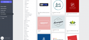
1. Canva
Canva is not a dedicated free logo generator, but it’s definitely one of our favorite tools used to create logos. It has many features that come with professional design programs, but despite the complexity of the tools available, the way they’re used is very simple. There’s even a huge catalogue of free stock images that you can use to create your logos.
The reason why we prefer Canva is that everything can be completely customized – from icons and shapes to colors and typography. Once you finish creating the logo, you can download it as a PNG file and use it everywhere. Your design will stay saved on their platform, so in case you need to change something (like color or size), you can do it easily.
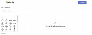
2. Shopify Online Logo Maker
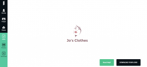
Shopify Online Logo Maker allows you to create a logo in a matter of seconds. This is a good option if you don’t have any technical skills whatsoever. Just type in your brand’s name, choose the appropriate icon and its position, and you’re all set!
The only downside is that you may not be able to make your idea fully come to life, and you run the rusk of seeing the same icons being used by someone else.
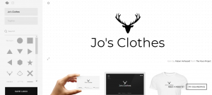
3. Logo Maker by Squarespace
Logo Maker by Sqarespace is a logo generator very similar to the previous one. It also works the same – just type in your business name, add a tagline related to your business and add the appropriate icon. Unlike Shopfy, Squarespace will allow you to change typography, which makes it easier to create a unique brand.
4. Logo Maker by Ucraft
Logo Maker by Ucraft comes in the form of a free app. Their logos tend to be more cartoonish in style, but if your audience is young and urban, you cannot go wrong with this logo maker. The main advantage of Ucraft is that you can download a free PNG file of your logo that can be used anywhere.
5. GraphicSprings Logo Creator
GraphicSprings Logo Creator is one of the best tools for creating free logos on the market. You can customize almost everything, which is ideal options for brands that want more control. It provides many of the same features that professional image editing programs provide. What makes this logo creator even more interesting is that you can pay to hire someone from their team to create the logo for you.
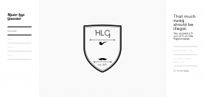
6. Hipster Logo Generator
As you can expect, the logos created in Hipster Logo Generator replicate the hipster style. If your customers are young, alternative people, this can be the perfect logo generator for you.
It’s very simple to use. All you have to do is run through a few options and start putting your logo together.
Looking for more? Check out this comprehensive article on the best logo software apps available today.


